Building a Better Word Cloud
- Mackenzie Mallett

- Jan 13, 2022
- 5 min read
Updated: Jan 14, 2022
Despite their role as the most archaic tool in your python package, word clouds seem to be around every corner. Sometimes it feels like you can’t view a qualitative analysis report without first having to look at what appears to be a form of abstract wallpaper. But even though they really aren't that helpful, they seem to have an enduring grip on the culture of the internet. Why is that, and is it possible to build a better word cloud?
The popularity of word clouds can be traced back to the early 2000s, and Flickr. Sometime in 2004, Flickr co-founder and interaction designer Stewart Butterfield started using word clouds as a way for users to find trending content on the site. Calling them “Tag Clouds” Butterfield’s concept ranked the most popular tags on users' photos and displayed them in an interactive word cloud where trending tags were, well, the biggest.
This creative use of word clouds as a website navigation tool on such a relevant website led to a surge of popularity for the strange-looking graph. I actually remember having to create word clouds for school projects, and students' visualizations dotting the hallways of my elementary school.
In a tale as old as Icarus himself, this widespread and frivolous use eventually caused a decline in popularity as even the first adopters turned their backs on the word cloud. In a 2006 Webby acceptance speech Flickr made it clear. “Sorry about the Tag Clouds.”
Word Clouds
If word clouds have been abandoned by even their earliest advocates, then why do they still endure in the data visualization community?
Well for starters, word clouds are a great starting point for people who are just learning how to visualize data. After spending hours on your first program, stringing together line after line of code to clean, parse, process and rank your text data, it’s easy to show off the fruits of your labour with a word cloud. They’re easy to customize too, so you can get creative with the colour, font, and shape.
The other strength of word clouds is that their concept is very easy to understand, especially for those who are unfamiliar with the data. Since ranking equates directly to size, the biggest word must be the most important. This makes word clouds a good visualization for communicating one or two central themes to the public.
This strength of simplicity also makes word clouds a good medium for introducing people to a qualitative analysis process. When showing a group of decision-makers the results of a qualitative analysis report, a word cloud at the beginning of the presentation can show viewers what kind of results they can expect.
Unfortunately, simplicity is a double-edged sword. What makes word clouds such a great starting point also prevents them from being useful in any sort of actionable analysis. While they are great for identifying the top couple of words in a data set, the rest are nearly impossible to identify because they are so close in size.
Take a look at the two word clouds below. They show the most common words in Amazon reviews for Apple’s Airpods, and are the endpoint of a script that pre-processes text data, including the removal of stop words.
In the cloud on the left the most common words are, unsurprisingly: great, quality, sound, and good. Clearly, customers think the product is of great quality, or maybe it comes with great sound quality. Good to know, sure, but hardly insight into the unique strengths of the product. Over to the right, the words are so close in size that it’s nearly impossible to decide where to start.
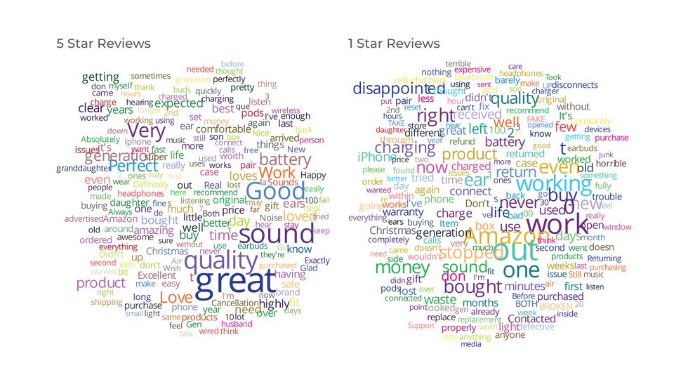
Of course, if you really want to learn about people who buy earbuds then you’ll need to understand more than just the top ten words. Words can have different meanings according to context. The word battery appears in both clouds above. Clearly it’s important, but is it good or bad? What you need are top themes.
Again, the word cloud falls short. Word clouds only measure single word frequency, which saps words of their context, and context is king. You could alter the graph to measure the frequency of a bigram or trigram, but this will just make the graph chaotic and illegible. There really isn’t a way for word clouds to show context without adding a slew of extra steps, at which point they’re no longer a simple and approachable graph.
What we really need is a visualization that is as simple and approachable as the word cloud, but one that displays the rich context of the text data.
Network Graphs
Enter the network graph. Network graphs are very flexible and can be applied to many situations, so it’s unsurprising to find that they have a role in qualitative analysis as well. Network graphs are similar to word clouds in that they are easy to implement, and their prevalence makes them easy to understand for the non-expert. But, the purpose of a network graph is to display the relationship between entities. which gives each entity a context to exist in, and context is king.
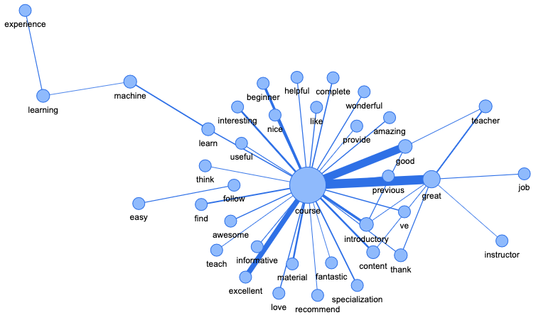
In qualitative analysis, network graphs look like this. Each word is represented by a node, and connections between nodes are represented by links (lines). A link exists when two words appear next to each other in the original text. When words appear next to each other more than once the line gets thicker, which shows not only a relationship but also the strength of that relationship.
Compare the two word clouds from earlier with the network graphs below. Again, the graph on the left represents 5-star reviews, and the one on the right represents 1-star reviews. By examining how nodes are connected, some key themes begin to appear.
For example, in the graph on the left, the nodes for sound and quality are connected to each other by a thick line, and to the nodes for good and great by thinner lines. This confirms the suspicion from earlier that great/good sound quality is important to people who bought these earbuds.
That’s not all. On closer examination, the nodes for time, charge, and wait form a cluster with the node for long. The cluster reveals a theme of long charge times not apparent in the word cloud. Combined with the knowledge that these were 5-star reviews, we can infer that the long charge times were worth it for great sound quality.


Choosing a network graph over a word cloud doesn't mean sacrificing creativity or aesthetics either. The parameters for colour and font can be changed just as easily in a network graph as a word cloud, and network graphs come with links and nodes to customize as well.


Word clouds are a great starting point for beginners just learning to visualize data. But they quickly lose their usefulness as you seek deeper insights. Enter the network graph. By focusing on relationships, they give words a context to live in. With the simple addition of context, qualitative analysis is taken to the next level where it provides actionable insights into the nature of text data.
If you’re new to network graphs and want to test your data on one, check out the previewer on the Unigrams site. You’ll be able to upload your own data set and see right away how a network graph makes it easier to understand.
If you found this article useful, you might enjoy our newsletter. It’s a bi-monthly email that keeps you up to date on what we’re up to and articles on topics we find interesting.
If you want to dive deeper, sign up for a free, 30-minute consultation to see what Analytics can do for you.


Comments