of clients choose dashboard reporting for interactive insights
Decreased redundancy by
week turnaround for initial dashboard builds
Kai Analytics builds dashboards that make complex information easy to understand. We go beyond basic charts by applying data visualization techniques that highlight what matters most. The result is analytics, campaign visibility, and boardroom presentations where the right people see the right data at the right time.
Most of our dashboards are developed in Microsoft Power BI, enabling scalable, secure, and interactive reporting that fits seamlessly with your existing infrastructure. Our dashboards include structured data models and flexible filters suited for analysts and non-technical users alike making it simple to make data look better while keeping accuracy intact.
Make decisions in minutes, not days. We integrate your existing data sources, including spreadsheets, cloud apps, and SQL databases, into unified, easy-to-understand dashboards. Every build applies our tips for visualization so your graphs and charts are not only functional but visually compelling.
Every dashboard includes clear documentation, screen-recorded training, and reliable ongoing support, ensuring ease-of-use even as your team grows or changes. Dashboards typically feature automated data refreshes from sources like SharePoint, Oracle, or Qualtrics, with built-in validation to ensure accuracy.
This effort assisted the WHO in drafting a new global traditional medicine strategy for the oeriod 2025–2034, and the resulting report and dashboards provide ongoing support for the many stakeholders involved in shaping TCIM policy.
For the American Orthotics & Prosthetics Association (AOPA), we streamlined the survey process for their annual O&P Compensation, Benefit, & Operations Surveys to ensure a positive experience for all their members.
Kai Analytics worked with the ACCJC to use advanced tools to provide the pertinent metrics and indicators needed to provide its members with a full understanding of where they are strong and where improvements are needed.
Dashboards designed to put data in context, covering public feedback, marketing performance, and more.
Quickly identify trends in student sentiment and course feedback.
Visualize citizen engagement and program outcomes.
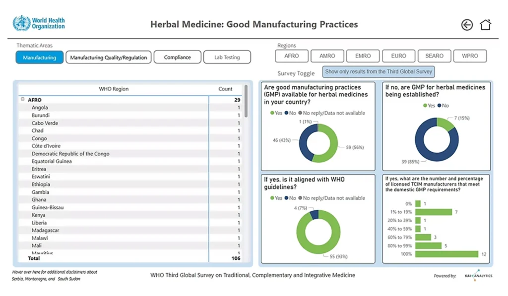
Clearly track program performance, patient feedback, and quality indicators.
Report real-time results to funders through interactive dashboards.
Use producer input to guide effective policy decisions.
Instantly see employee engagement trends and productivity metrics.
Monitor user activity, churn, and NPS data at scale.
Power BI, Tableau, and Looker Studio. We choose tools that best fit your existing tech stack and team experience.
Yes. We seamlessly connect APIs, databases, and spreadsheets to automate your dashboards.
No problem. Dashboards are intuitive, supported by documentation and optional training videos so non-technical users feel confident.
Absolutely. Dashboards are customized with your brand colours, typography, and layouts, ensuring a cohesive experience.
Dashboards are typically ready within 3–5 weeks, depending on data complexity and integrations.
We follow established data visualization tips and best practices to make your graphs clear, attractive, and easy to interpret without sacrificing accuracy.
Let’s talk about your data challenges and explore the right solution for your team. Book a free 1-on-1 consultation with our experts to get tailored recommendations based on your goals.