Higher Education Research That Fuels Student and Institutional Success
We help colleges, universities, and education networks translate complex data into strategies that improve student outcomes, strengthen institutional performance, and guide policy. Campus climate surveys, enrollment trend analysis, and other research all contribute to the informed decisions our work makes possible.
Solving the Challenges Facing Modern Education Leaders
Institutions must adapt to changing student needs, shifting funding landscapes, and evolving expectations for equity and inclusion. Without the right tools, analyzing feedback, measuring outcomes, and forecasting trends can be slow and fragmented, making it harder to respond quickly and strategically.
Kai Analytics works alongside your team to identify opportunities and remove barriers, delivering the clarity you need to meet institutional priorities.
Kai Analytics partners with leading universities, colleges, and academic organizations to deliver measurable results.
0+
institutions served
Student survey participation increases of
0%
Data Solutions That Drive Smarter Decisions
Our services are designed to solve your most pressing institutional priorities.
Boost Retention with Institutional Surveys
Multilingual design, deployment, and analysis for students, faculty, and staff, including advanced student satisfaction survey design and assessment analytics.
Get Decision-Ready Dashboards
Consolidate data from across your institution into one clear, actionable view.
Feedback That Shapes Strategy
Transform open-text responses into actionable insights using advanced sentiment analysis.
Predict and Plan Ahead
Use predictive analytics to identify trends and strengthen academic outcomes.
Kevin convincingly demonstrated that he could deliver on the assignment, and also showed great enthusiasm in working with us and on the research topic.
We were not disappointed. If anything, Kevin over-delivered by proactively making suggestions to improve the overall quality of our study and report.
Global Center on Adaptation
Kai Analytics went above and beyond while closely respecting project timeframes.
Not only did they support our open-ended question analytics, but they also offered advice on best practice for survey representation, results design and outline, and report writing, in a multinational context. Kai Analytics was a key partner of the Alliance this year.
Mégane Visette, Canadian Sherpa
G20 Young Entrepreneurs Alliance
Review:
1) outstanding dedication 2) quick response rate and delivered results 3) professionalism (the quality of results is very high) 4) proactive engagement 5) a positive attitude towards any challenge and eagerness to find the solution to solve it 6) ability to work under strict deadlines and even completing tasks before the agreed time (deadline)
Galiya I., Data Management and Regional Coordinator
United Nations Office for Disaster Risk Reduction (UNDRR)
The Kai Analytics team is exceptionally flexible and adaptable in project design, and adaptation of that design as the project unfolds.
They’ve never hesitated to provide additional data or analysis on the fly as requested, which was important for our project that was deeply rooted in discovery and shifting scope. Deliverables are always on time and in depth, usually more so than expected. It has been an outstanding experience working with them overall and have no question whatsoever that we’ll be turning to them again in the future.
Quay M., Product Lead,
Ninja Forms
Not only did the report provide the information we needed, but it was delivered less than two weeks after we submitted the data to Kai Analytics.
Working with Kai Analytics you can expect superb communication and quality. We look forward to the opportunity to work with Kai Analytics again.
Dana P., Learning Analyst
Thompson Rivers University
Kai analytics were flexible and responsive to the various changes that were required throughout the project lifecycle.
This included being very patient and understanding when amendments and changes in requirements were communicated. Kai’s patience and agility was valued and carried out with understanding and support. The final products have been well received and we have been incredibly happy with the outputs.
The British Council
The Partner of Choice for Academic Leaders
You need a partner who understands both the rigor of institutional research and the application of assessment analytics in higher education decision-making.
Certified & Compliant
CRIC certified, Living Wage Employer, Microsoft Partner, ensuring ethical research, secure data handling, and trusted technology.
Proven in Higher Ed
Partnered with leading universities and academic associations.
Client-Backed Results
"What would have taken us weeks or months took them a matter of days." — Manager of Integrated Planning, Thompson River University
Let’s talk about your data challenges and explore the right solution for your team. Book a free 1-on-1 consultation with our experts to get tailored recommendations based on your goals.
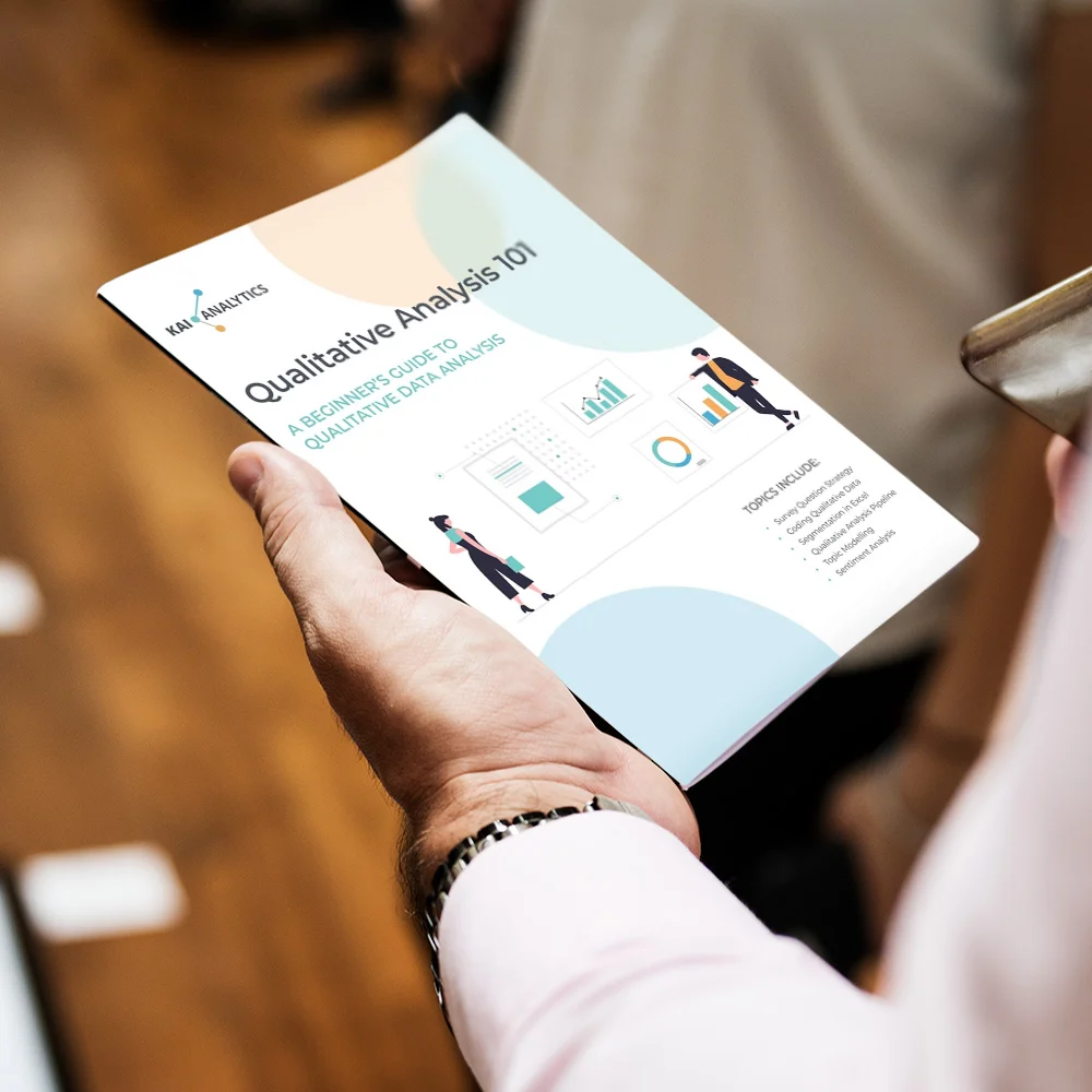
Your Free Beginner’s Guide: Quick Tips for Coding & Interpreting Qualitative Data
Are you looking for a free qualitative data analysis software? Download our guide to learn the best practices for handling qualitative data, even if you are just starting with spreadsheets or free qualitative data analysis software.
Perfect for research teams, program managers, and communicators handling unstructured feedback.